


With over 5.5 million new business applications in 2021 and the number continuing to grow, competition has never been higher.
This makes it vital for small businesses to find something unique that sets them apart from the competition.

One way (and perhaps the easiest way) to stand out is to create a distinctive brand colour palette guide that suits your business personality AND resonates with your audience.
But how can you ensure that your chosen colours reflect your brand personality and values? Are there specific colours that resonate better with certain types of services? And what tools can you use to help you create your brand palette?
In this article, we’ll discuss a brand colour palette guide, how to create one that suits your brand and customers, and much more.
What is a brand colour palette guide?
Put simply, a brand colour palette guide is a document or style guide that defines the specific colours used to represent a brand. It’s an essential part of your branding as the colours in your palette will be used throughout your design elements, including your:
- Logo
- Website
- Social media
- Marketing materials
- Packaging
- Staff uniforms
- And more

Why are brand colours and personality important?
There are many reasons why choosing the right brand colours and personality is crucial to helping you succeed. These include the following.
Consistency leads to more sales
68% of businesses say that brand consistency leads to revenue growth.
This is because consistent use of brand colours helps your business come across as reliable and credible—two of the most critical factors of long-term business success.
Due to your reliability, you’ll easily overcome their fears and hesitancy to purchase from you, leading to more sales and profit.
Brand differentiation
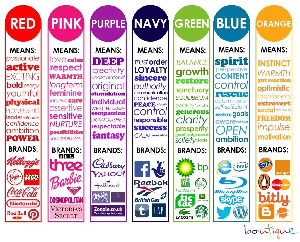
Clear brand colours and values help you stand out from competitors since different colours evoke varying emotions.
For example, choosing bright and bold colours, like yellow, can evoke a sense of happiness and energy, while blue conveys professionalism.
Ultimately, the colours you choose must convey your personality and values so you can connect with customers with similar values. This can go a long way in creating brand loyalty and repeat business.
Seamless brand experience
A consistent colour palette across all touchpoints, including your website, social media, and packaging, creates a seamless brand experience and strengthens your brand identity.
How do you choose colours that reflect your brand’s personality and values?
Choosing colours that reflect your brand and personality involves several key steps.
1. Understand colour psychology
colour theory and psychology are the studies of how colours affect people’s perceptions and behaviors. As mentioned earlier, different colours evoke various emotions and feelings. For example:
- Red: Excitement, passion, urgency
- Blue: Trust, professionalism, calm
- Green: Health, tranquillity, growth
- Yellow: Happiness, energy, warmth
- Purple: Luxury, creativity, wisdom
- Black: Sophistication, power, elegance
- White: Simplicity, purity, cleanliness
Understanding these emotions and associations can help you choose colours that suit the feelings you want to evoke in your customers when they look at your website and content.
2. Define your brand personality and values
There are 12 brand personality archetypes. Each of these archetypes has different core desires and characteristics.
- The Innocent
- The Explorer
- The Sage
- The Hero
- The Outlaw
- The Magician
- The Lover
- The Jester
- The Caregiver
- The Ruler
- The Creator
- The Everyman
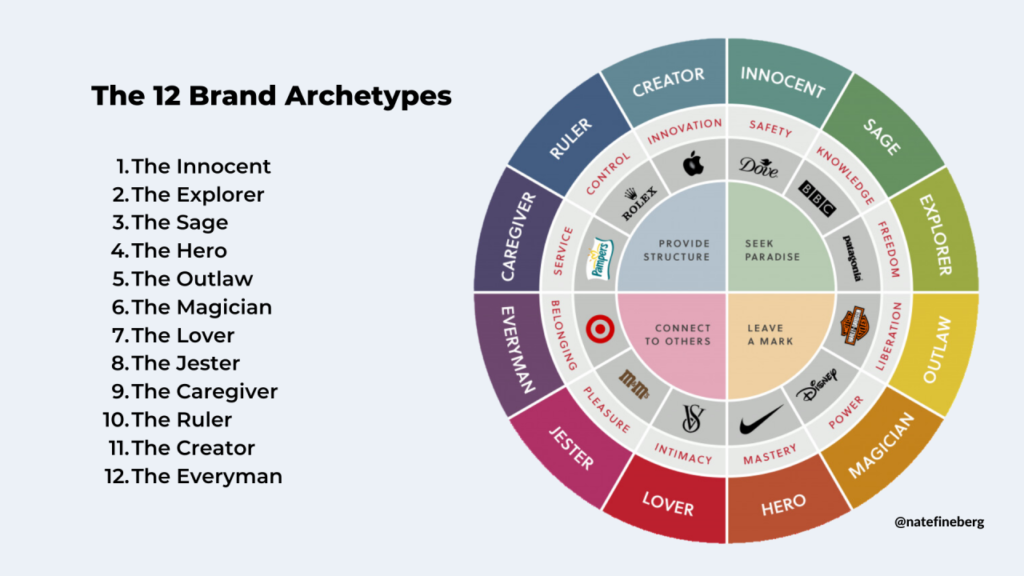
For example, brands with the Hero archetype, such as Nike and BMW, strongly desire to prove themselves. Key characteristics of these brands include courage, strength, and inspiration.
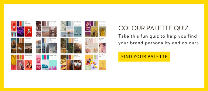
If you don’t know what your brand archetype is, don’t worry! We designed the colour Palette Brand Personality Quiz just for you. The Quiz will help you uncover the archetype that perfectly reflects your brand’s values and also show you how to leverage it for stronger connections.
3. Analyze your target audience
Consider the preferences and cultural perceptions of your target audience. Sometimes, different demographics and cultures interpret colours differently. For example, some cultures associate white with purity, while other cultures may associate it with mourning.
4. Evaluate competitors
You can look at your competitor’s brand palettes for additional inspiration to see which colours they use. Depending on your industry, several competitors may use similar colours.
For example, if your business is in the tech industry, you’ll notice that many competitors often use purples and dark blues since these colours represent professionalism and wisdom.
In that case, you can also consider including purple or blue in your palette and other complementary colours, such as yellow, to differentiate yourself.
5. Create a colour palette
You can create your colour palette after determining your brand archetype and researching your target audience and competitors. Your palette should ideally consist of the following:
- A primary colour: Your primary colour embodies your brand’s core values and personality and will be the dominant colour in your branding.
- Secondary colours: Your secondary colours complement the primary colour and provide versatility.
- Accent colours: Your accent colours (or tertiary colours) provide additional flexibility to make your brand stand out even more.
You can use a colour wheel to determine your colour codes.
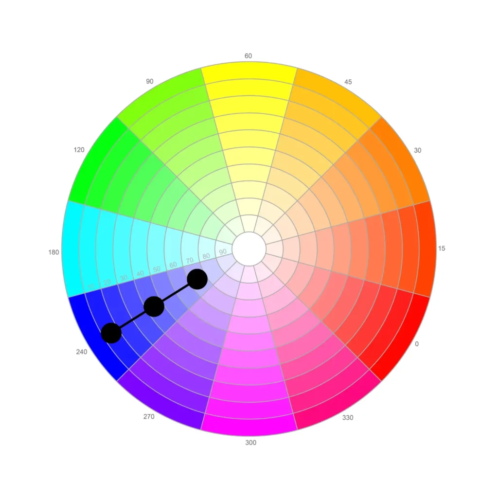
To create a good balance, try choosing colour combinations that include bold colours like red, blue, and purple, and neutral colours like black, white, and grey. White backgrounds with bold text or visuals can be particularly effective.
6. Test and evaluate
After you’ve chosen your core brand colours, create mockups of your logo and marketing materials using your desired colours to see if everything looks good together and evokes the right emotions.
Also, the difference between digital design and physical design should be considered. You’ll need to use different colour codes for your digital visual elements, such as social media ads, versus elements you create for traditional marketing, such as brochures. Be sure to test your colours on digital and traditional mediums.
You can also take it further and ask your target audience for feedback.
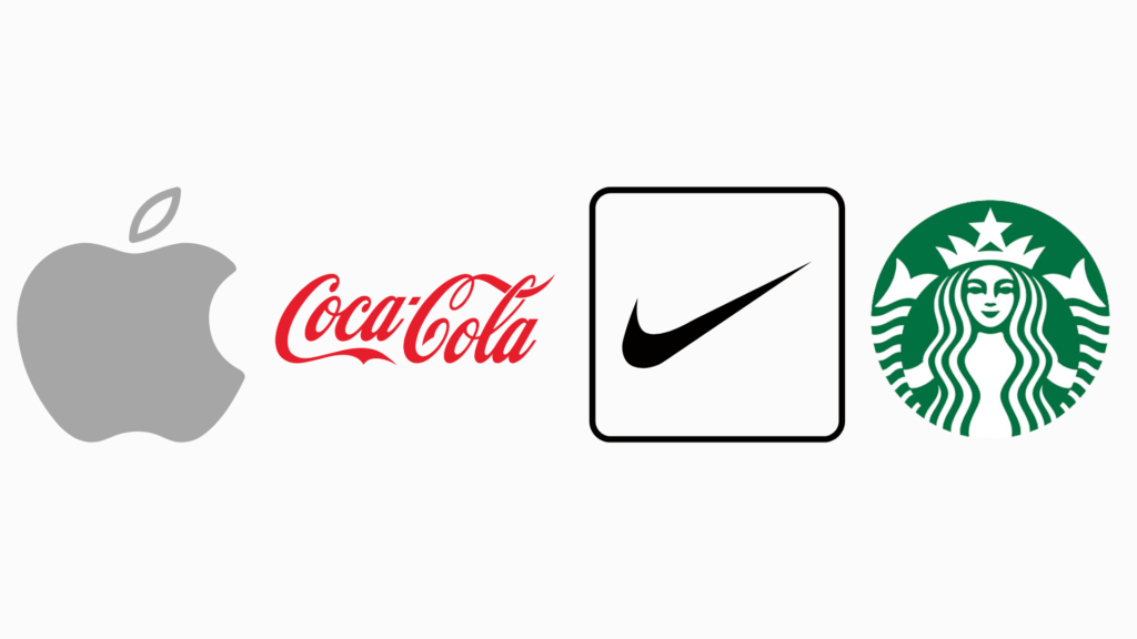
Examples of brands that effectively use their brand colours
For reference, these three successful brands executed their brand colours exceptionally well.
- Coca-Cola: Coca-Cola’s primary colour is red, which conveys excitement, energy, and passion, perfectly aligning with its brand personality of joy and refreshment.
- Starbucks: Starbucks uses green, symbolizing growth, health, and tranquillity. This aligns with its values of sustainability and provides a relaxing atmosphere.
- Apple: Apple’s use of sleek, minimalist black and white conveys sophistication, elegance, and innovation, reflecting their brand values of simplicity and cutting-edge technology.
FAQ about brand colour palettes
Are there specific colours that resonate better with certain services or industries?
Yes, specific colours are often associated with different types of services and industries. For example, health and wellness services usually use the colours green, blue, and white, while high-end and luxury brands use gold, silver, and black.
What if I’m drawn to colours that might not align with my target audience’s preferences?
Choosing colours for your brand should balance personal preference and research. You must ensure that most of your colours resonate with your target audience. However, you can add additional colours that you like as well—as long as they work well together.
For example, suppose your target audience resonates with green. Even though green may not be your favorite colour, you can still use green and combine it with a different colour, such as blood orange. That way, you’re choosing something you like and something your audience likes.
Use our Quiz to determine your brand colours and personality
Choosing the wrong brand colours can be detrimental to your brand’s short—and long-term success. Consider your brand personality, values, and target audience when choosing your colours.
To help you, you can take our Colour Palette Brand Personality Quiz. This way, you can rest assured that you’re choosing colours that’ll help you attract the right audience and that’ll make you proud.